

What Does the Three-Color Rule Mean?
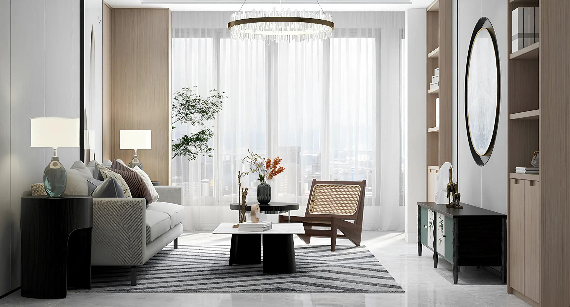
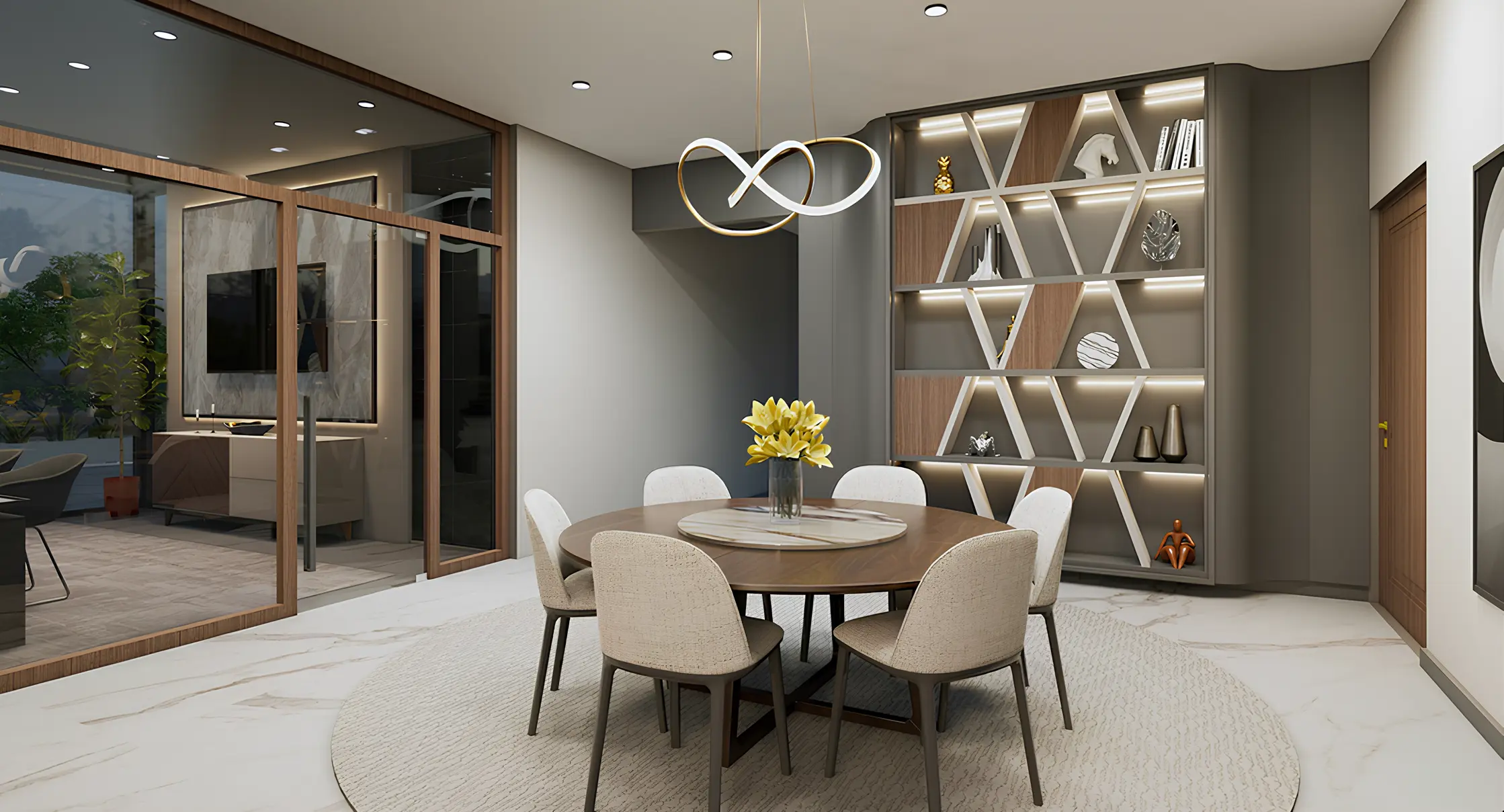
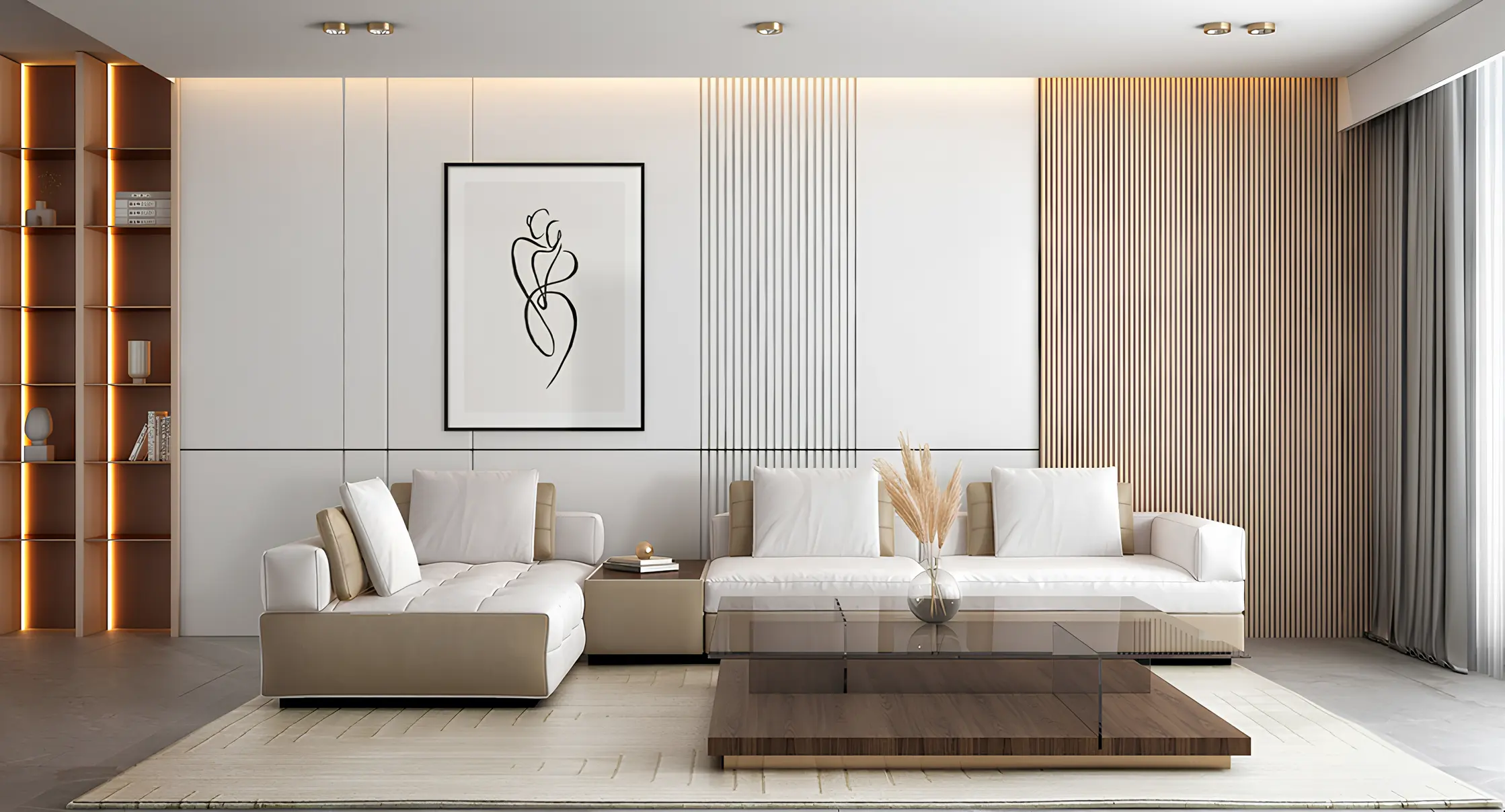
The rule suggests limiting the color scheme of a room to a maximum of three colors: a dominant base color, a secondary color, and an accent color. The base color takes up the largest share, for example on walls and large pieces of furniture. The secondary color complements it, for instance in curtains, rugs, or smaller furniture. The accent color is used deliberately and sparingly, such as in cushions, vases, or artwork, and provides the key visual point of interest.
Why Fewer Colors Often Work Better
Many people want to include as many of their favorite colors as possible in one room, but the result can quickly feel restless and arbitrary. The three-color rule deliberately sets boundaries and forces you to establish priorities. The result is a room that feels calm, elegant, and considered rather than overloaded.
An Example of a Harmonious Color Scheme
A proven scheme for a warm, timeless home could consist of a creamy beige base tone for walls and floors, complemented by natural warm beige shades in textiles and furniture, plus a dark accent such as chocolate brown or graphite in selected details. This combination feels refined, warm, and modern at the same time, a style that works equally well in Berlin period apartments and modern new-build homes.
How to Apply the Three-Color Rule in Practice
Before choosing colors, it is useful to define the overall feeling you want the room to create: should it feel calm and restrained, or more lively and welcoming? Only then should the three colors be selected and used consistently throughout the room. It is important for the colors to appear not only on the walls but also in textiles, furniture, and accessories so that the overall result feels coherent.
Color Advice from Experienced Interior Designers
The right choice of color depends on many factors, including the amount of natural light, room size, existing materials, and personal taste. In our showroom in Berlin, clients can combine color and material samples directly and assess them in natural light. Through close collaboration with furniture, lighting, and textile suppliers, we develop color concepts tailored precisely to each home.
Common Mistakes in Color Design
A classic mistake is to distribute all three colors in equal proportions throughout the room. This creates no clear focal point and instead produces a restless visual effect. It is equally problematic to choose colors that look attractive individually but do not share a similar temperature when combined. Cool and warm tones can be difficult to harmonize. For greater certainty, it is best to work with color families of a similar temperature and ideally test the chosen combination using material samples in daylight before making major decisions.
From Color Selection to a Complete Room Concept
The three-color rule is an excellent starting point, but a complete room concept only emerges when color works together with materials, texture, and lighting. The same color palette can look completely different depending on the selected materials, such as matte wood, glossy marble, or soft linen. For that reason, color decisions should not be made in isolation but together with the choice of materials and furniture.